Chapter 1: DATA#
Concept map:

1.1 Introduction to data#
Data is the fuel for stats (see section outline for more details).
1.2 Data in practice#
Before it can be used in statistical analyses, data often requires pre-processing steps which are can like extract, transform, and load (ETL) as shows below:

We’ll illustrate these steps based on the data for Amy’s research:
Extract data from spreadsheet file using
read_excelTransform to tidy format using
melt, cleanup, then save data as a CSV fileLoad data again using
read_csvto make sure all good
Notebook setup#
We begin by importing some Python modules for data analysis and plotting.
import pandas as pd    # data manipulations
import seaborn as sns  # plotting and visualizations
# notebook and figures setup
%matplotlib inline
import matplotlib.pyplot as plt
sns.set(rc={'figure.figsize':(8,5)})
# silence annoying warnings
import warnings; warnings.filterwarnings('ignore')
Extract#
We can use the function read_excel in the pandas module, which have imported as the shorter alias pd to extract the data the sheet named “Data” in the spreadhseet file.
rawdf = pd.read_excel("data/employee_lifetime_values_records.ods", sheet_name="Data")

# if you get an error on the above line, run `!pip install odfpy` then this:
# rawdf = pd.read_excel("https://github.com/minireference/noBSstats/raw/main/stats_overview/data/employee_lifetime_values_records.ods", sheet_name="Data")

# the data extracted from the spreadsheet is now stored in rawdf, a pd.DataFrame object
rawdf
| Group NS | Group S | |
|---|---|---|
| 0 | 923.87 | 1297.44 |
| 1 | 751.38 | 776.41 |
| 2 | 432.83 | 1207.48 |
| 3 | 1417.36 | 1203.30 |
| 4 | 973.24 | 1127.58 |
| 5 | 1000.52 | 1464.32 |
| 6 | 1040.38 | 926.94 |
| 7 | 1324.41 | 1550.08 |
| 8 | 1171.52 | 1111.03 |
| 9 | 1195.03 | 1057.69 |
| 10 | 664.63 | 1361.05 |
| 11 | 769.31 | 1108.01 |
| 12 | 690.74 | 1054.53 |
| 13 | 1284.31 | 1232.11 |
| 14 | 958.96 | 623.06 |
| 15 | 856.65 | 862.36 |
| 16 | 1124.43 | 1011.34 |
| 17 | 1521.95 | 1088.06 |
| 18 | 987.67 | 1188.16 |
| 19 | 1070.90 | 1434.01 |
| 20 | 1110.94 | 843.81 |
| 21 | 1620.93 | 1716.61 |
| 22 | 1251.99 | 987.64 |
| 23 | 860.90 | 1094.02 |
| 24 | 963.01 | 1225.66 |
| 25 | 677.76 | 931.61 |
| 26 | 949.26 | 1329.68 |
| 27 | 990.13 | 1293.03 |
| 28 | 1255.27 | 1240.44 |
| 29 | 716.64 | 1105.59 |
| 30 | 1013.83 | NaN |
Note there is a missing value (denoted NaN) in the last row of Group S. We’ll have to fix that in the data-cleaning step later on.
# the "shape" of the dataframe is
rawdf.shape
(31, 2)
# we can quickly see the statistics for the two groups
rawdf.describe().T
| count | mean | std | min | 25% | 50% | 75% | max | |
|---|---|---|---|---|---|---|---|---|
| Group NS | 31.0 | 1018.41129 | 265.815869 | 432.83 | 858.7750 | 990.130 | 1183.2750 | 1620.93 |
| Group S | 30.0 | 1148.43500 | 233.037704 | 623.06 | 1022.1375 | 1119.305 | 1279.8825 | 1716.61 |
The above table contains some useful summary for the two groups in the data. We can confirm we have 31 data points for Group NS, 30 data points for Group S and see all the descriptive statistics like mean, standard deviation, min/max, and the quartiles (more on that later).
Transform and clean the raw data#
Currently data is in a “wide” format (block where each row contains multiple observations)
Instead, we prefer all data to be in “tall” format where each row is a single observation

The operation to convert is called melt and there is a Python method for the same name:
# before melt...
# rawdf
tmpdf1 = rawdf.melt(var_name="group", value_name="ELV")

# ...after melt
tmpdf1
| group | ELV | |
|---|---|---|
| 0 | Group NS | 923.87 |
| 1 | Group NS | 751.38 |
| 2 | Group NS | 432.83 |
| 3 | Group NS | 1417.36 |
| 4 | Group NS | 973.24 |
| ... | ... | ... |
| 57 | Group S | 1329.68 |
| 58 | Group S | 1293.03 |
| 59 | Group S | 1240.44 |
| 60 | Group S | 1105.59 |
| 61 | Group S | NaN |
62 rows × 2 columns
# lets use short labels...
tmpdf2 = tmpdf1.replace({"Group NS": "NS", "Group S": "S"})
tmpdf2
| group | ELV | |
|---|---|---|
| 0 | NS | 923.87 |
| 1 | NS | 751.38 |
| 2 | NS | 432.83 |
| 3 | NS | 1417.36 |
| 4 | NS | 973.24 |
| ... | ... | ... |
| 57 | S | 1329.68 |
| 58 | S | 1293.03 |
| 59 | S | 1240.44 |
| 60 | S | 1105.59 |
| 61 | S | NaN |
62 rows × 2 columns
# clean data (remove NaN values)
df = tmpdf2.dropna()
df
| group | ELV | |
|---|---|---|
| 0 | NS | 923.87 |
| 1 | NS | 751.38 |
| 2 | NS | 432.83 |
| 3 | NS | 1417.36 |
| 4 | NS | 973.24 |
| ... | ... | ... |
| 56 | S | 931.61 |
| 57 | S | 1329.68 |
| 58 | S | 1293.03 |
| 59 | S | 1240.44 |
| 60 | S | 1105.59 |
61 rows × 2 columns
Click here to see an online visualization of these three operations on a small sample from the data using pandastutor.com.
Save the data as a CSV file#
df.to_csv('data/employee_lifetime_values.csv', index=False)
# !du data/employee_lifetime_values.csv
# !head data/employee_lifetime_values.csv
# Try loading the data to make sure it is the same
df = pd.read_csv('data/employee_lifetime_values.csv')
df
| group | ELV | |
|---|---|---|
| 0 | NS | 923.87 |
| 1 | NS | 751.38 |
| 2 | NS | 432.83 |
| 3 | NS | 1417.36 |
| 4 | NS | 973.24 |
| ... | ... | ... |
| 56 | S | 931.61 |
| 57 | S | 1329.68 |
| 58 | S | 1293.03 |
| 59 | S | 1240.44 |
| 60 | S | 1105.59 |
61 rows × 2 columns
The dataframe df is now in long format and this will make doing stats and plotting much easier from now on.
Data cleaning and data munging are important prerequisites for any statistical analysis. We’ve only touched the surface here, but it’s important for you to know these steps exist, and are often the most time consuming part of any “data job.”
pandas sidenote: selecting subsets#
# first create a boolean "mask" of rows that match
# df["group"] == "S"
# selects subset that corresponds to the mask
# df[df["group"]=="S"]
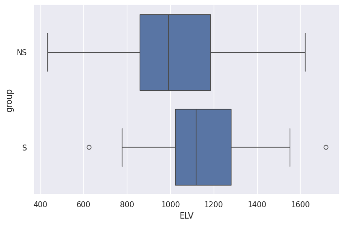
1.3 Descriptive statistics#
Use
.describe()to get summary statisticsDraw a histogram
Draw a boxplot
df[df["group"]=="S"].describe().T
| count | mean | std | min | 25% | 50% | 75% | max | |
|---|---|---|---|---|---|---|---|---|
| ELV | 30.0 | 1148.435 | 233.037704 | 623.06 | 1022.1375 | 1119.305 | 1279.8825 | 1716.61 |
df[df["group"]=="NS"].describe().T
| count | mean | std | min | 25% | 50% | 75% | max | |
|---|---|---|---|---|---|---|---|---|
| ELV | 31.0 | 1018.41129 | 265.815869 | 432.83 | 858.775 | 990.13 | 1183.275 | 1620.93 |
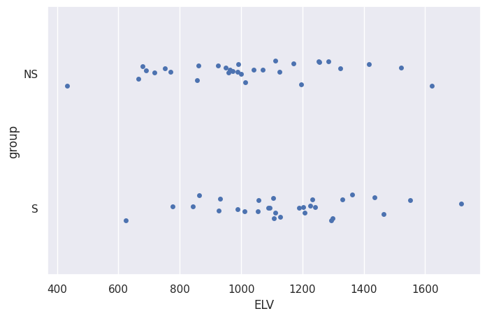
Visualizations#
sns.boxplot(data=df, x="ELV", y="group")
<Axes: xlabel='ELV', ylabel='group'>
sns.stripplot(data=df, x="ELV", y="group")
<Axes: xlabel='ELV', ylabel='group'>
# sns.histplot(data=df, x="ELV", hue="group")
# better histplot
fig, axes = plt.subplots(2, 1, sharex=True)
blue, orange  = sns.color_palette()[0], sns.color_palette()[1]
sns.histplot(data=df[df["group"]=="NS"], x="ELV", color=blue, ax=axes[0])
axes[0].axvline(df[df["group"]=="NS"]["ELV"].mean(), 0, 12)

sns.histplot(data=df[df["group"]=="S"], x="ELV", color=orange, ax=axes[1])
axes[1].axvline(df[df["group"]=="S"]["ELV"].mean(), 0, 12, color=orange)
<matplotlib.lines.Line2D at 0x7f40defb6660>
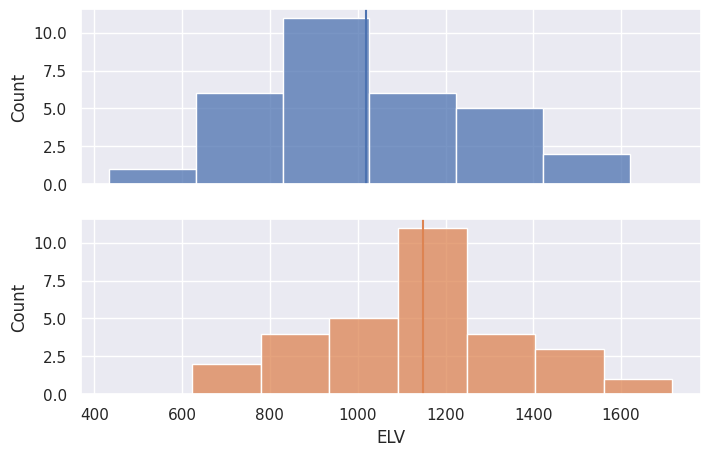
Observed difference in means in the data sample#
meanS = df[df["group"]=="S"]['ELV'].mean()
meanNS = df[df["group"]=="NS"]['ELV'].mean()

# compute d, the difference in ELV means between two groups
d = meanS - meanNS
print("The difference between groups means is", round(d,2))
The difference between groups means is 130.02
Observed variability in the data#
stdS = df[df["group"]=="S"]['ELV'].std()
print("Standard deviation for Group S is", round(stdS,2))

stdNS = df[df["group"]=="NS"]['ELV'].std()
print("Standard deviation for Group NS is", round(stdNS,2))
Standard deviation for Group S is 233.04
Standard deviation for Group NS is 265.82
Summary#
Reminder: goals is to determine if stats training leads to meaningful ELV increase
Numerically and visually, we see that employees who received stats training (Group B) have higher ELV, but could the observed difference be just a fluke?
Facts: the observed difference in means is
d= \(\overline{x}_S - \overline{x}_{NS} = 130.03\) and the standard deviation of the sample is 233 and 266 respectively. Is a difference of 130 (signal) significant for data with variability ~250 (noise)?
Discussion#
the data samples we have collected contain A LOT of variability
we need a language for describing variability (probability theory)
we can use probability theory for modelling data and considering hypothetical scenarios
Learning the language of probability theory will help us rephrase the research questions as precise mathematical problems:
Does statistical training make a difference in ELV?
We’ll define a probability model for a hypothetical situation where statistics training makes no difference and calculate how likely it is to observe the difference \(d= \overline{x}_S - \overline{x}_{NS} = 130\) between two groups due to chance.How big is the increase in ELV that occurs thanks to stats training?
We’ll produce an estimate of the difference in ELV between groups that takes into account the variability of the data.
Next step#
Ready for an intro to probability theory? If so, move on to the next notebook 02_PROB.ipynb.