Section 1.3 — Descriptive statistics#
This notebook contains all the code from Section 1.3 Descriptive Statistics of the No Bullshit Guide to Statistics.
All the data manipulations are done using the pandas library,
and data visualizations are based on the seaborn library.
Code cells containing an ALT comment and commented out show alternative way for computing the same quantities or additional details that were not included in the book. It’s up to you if you want to learn about these alternative options—just uncomment the code and execute.
Notebook setup#
# Ensure required Python modules are installed
%pip install --quiet numpy scipy seaborn pandas==3.0.1 ministats
Note: you may need to restart the kernel to use updated packages.
import numpy as np
import pandas as pd
import matplotlib.pyplot as plt
import seaborn as sns
# Pandas setup
pd.set_option("display.precision", 2)
# Figures setup
plt.clf()  # needed otherwise `sns.set_theme` doesn't work
sns.set_theme(
    context="paper",
    style="whitegrid",
    palette="colorblind",
    rc={"font.family": "serif",
        "font.serif": ["Palatino", "DejaVu Serif", "serif"],
        # "figure.figsize": (7,4)},
        "figure.figsize": (5, 2)},
)
%config InlineBackend.figure_format = 'retina'
<Figure size 640x480 with 0 Axes>
# Simple float __repr__
import numpy as np
if int(np.__version__.split(".")[0]) >= 2:
    np.set_printoptions(legacy='1.25')
# Download datasets/ directory if necessary
from ministats import ensure_datasets
ensure_datasets()
datasets/ directory already exists.
Numerical variables#
Definitions#
Descriptive statistics for the students dataset#
Load the students dataset from CSV#
import pandas as pd
students = pd.read_csv("datasets/students.csv")
students
| student_ID | background | curriculum | effort | score | |
|---|---|---|---|---|---|
| 0 | 1 | arts | debate | 10.96 | 75.0 |
| 1 | 2 | science | lecture | 8.69 | 75.0 |
| 2 | 3 | arts | debate | 8.60 | 67.0 |
| 3 | 4 | arts | lecture | 7.92 | 70.3 |
| 4 | 5 | science | debate | 9.90 | 76.1 |
| 5 | 6 | business | debate | 10.80 | 79.8 |
| 6 | 7 | science | lecture | 7.81 | 72.7 |
| 7 | 8 | business | lecture | 9.13 | 75.4 |
| 8 | 9 | business | lecture | 5.21 | 57.0 |
| 9 | 10 | science | lecture | 7.71 | 69.0 |
| 10 | 11 | business | debate | 9.82 | 70.4 |
| 11 | 12 | arts | debate | 11.53 | 96.2 |
| 12 | 13 | science | debate | 7.10 | 62.9 |
| 13 | 14 | science | lecture | 6.39 | 57.6 |
| 14 | 15 | arts | debate | 12.00 | 84.3 |
# what type of object is `students`?
type(students)
pandas.DataFrame
# rows
students.index
RangeIndex(start=0, stop=15, step=1)
# columns
students.columns
Index(['student_ID', 'background', 'curriculum', 'effort', 'score'], dtype='str')
# info about memory and data types of each column
students.info()
<class 'pandas.DataFrame'>
RangeIndex: 15 entries, 0 to 14
Data columns (total 5 columns):
 #   Column      Non-Null Count  Dtype
---  ------      --------------  -----
 0   student_ID  15 non-null     int64
 1   background  15 non-null     str
 2   curriculum  15 non-null     str
 3   effort      15 non-null     float64
 4   score       15 non-null     float64
dtypes: float64(2), int64(1), str(2)
memory usage: 923.0 bytes
Focus on the score variable#
Let’s look at the score variable.
scores = students["score"]
scores
0     75.0
1     75.0
2     67.0
3     70.3
4     76.1
5     79.8
6     72.7
7     75.4
8     57.0
9     69.0
10    70.4
11    96.2
12    62.9
13    57.6
14    84.3
Name: score, dtype: float64
scores.count()
15
list(scores.sort_values())
[57.0,
 57.6,
 62.9,
 67.0,
 69.0,
 70.3,
 70.4,
 72.7,
 75.0,
 75.0,
 75.4,
 76.1,
 79.8,
 84.3,
 96.2]
# # ALT: use the Python builtin function `sorted`
# sorted(scores)
Min, max, and median#
scores.min()
57.0
scores.max()
96.2
scores.max() - scores.min() # range
39.2
scores.median()
72.7
Strip plot#
import seaborn as sns
sns.stripplot(data=students, x="score", jitter=0);
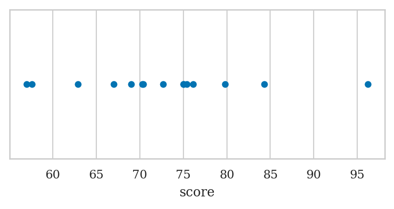
We used the option jitter=0 to disable the seaborn default behaviour
of adding a small amount of random vertical displacement to each data point,
which we don’t need for this plot.
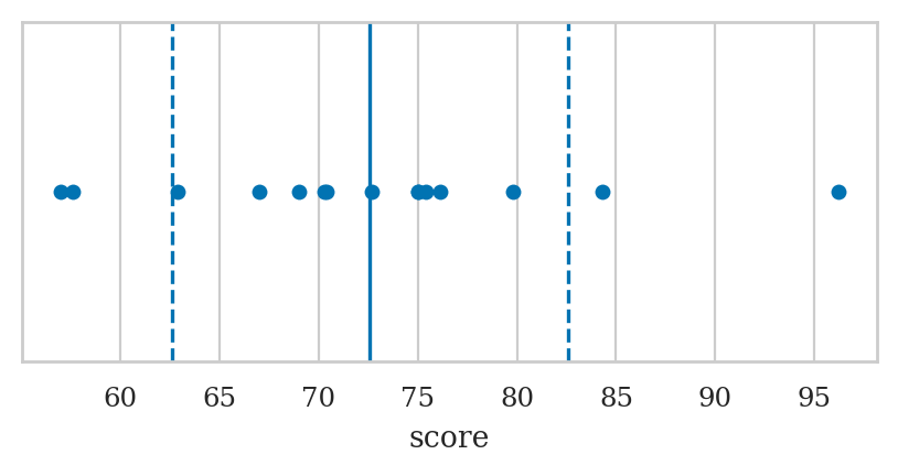
Here is a version of the strip plot that also shows a solid vertical line at the mean \(\mathbf{mean}(\mathbf{s})\), and dashed vertical lines at \(\mathbf{mean}(\mathbf{s}) - \mathbf{std}(\mathbf{s})\) and \(\mathbf{mean}(\mathbf{s}) + \mathbf{std}(\mathbf{s})\).
ax = sns.stripplot(data=students, x="score", jitter=0)
ax.axvline(x=scores.mean())
ax.axvline(x=scores.mean()+scores.std(), linestyle="--")
ax.axvline(x=scores.mean()-scores.std(), linestyle="--");
Mean, variance, and standard deviation#
scores.mean()
72.58
scores.var() # sample variance sum((scores-mean)**2)/(n-1)
99.58600000000001
scores.std() # sample standard deviation
9.979278531036199
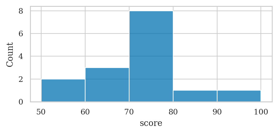
Histograms#
bins = [50, 60, 70, 80, 90, 100]
pd.cut(scores, bins=bins, right=False).value_counts(sort=False)
score
[50, 60)     2
[60, 70)     3
[70, 80)     8
[80, 90)     1
[90, 100)    1
Name: count, dtype: int64
# The mode is the bin [70,80) since it contains 8 values
bins = [50, 60, 70, 80, 90, 100]
sns.histplot(data=students, x="score", bins=bins);
Quartiles#
Q1 = scores.quantile(q=0.25)
Q1
68.0
Q2 = scores.quantile(q=0.5)
Q2
72.7
Q3 = scores.quantile(q=0.75)
Q3
75.75
IQR = Q3 - Q1
IQR
7.75
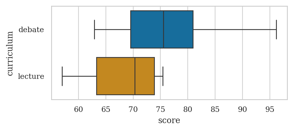
Box plots#
# box plot
sns.boxplot(data=students, x="score", width=0.4);
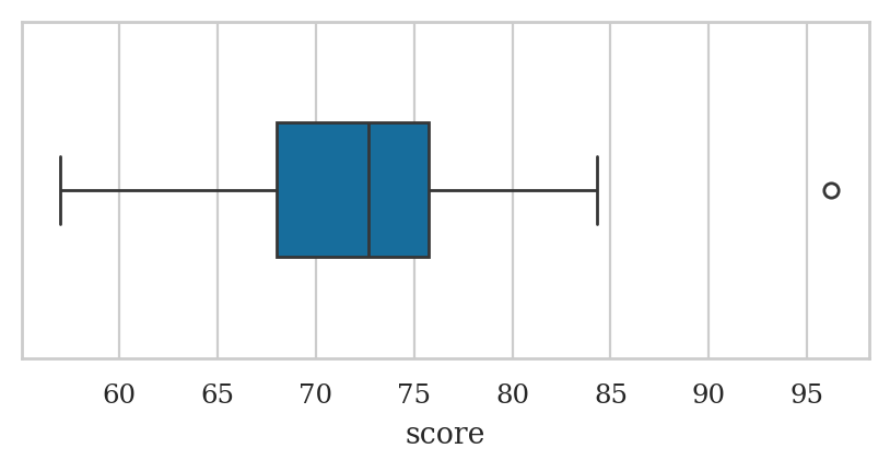
The score 96.2 is drawn is drawn as a separate point because it falls outside the interval \([\mathbf{Q}_{1} - 1.5 \cdot \mathbf{IQR}, \mathbf{Q}_{3} + 1.5 \cdot \mathbf{IQR}]\).
# interval for
Q1 - 1.5*IQR, Q3 + 1.5*IQR
(56.375, 87.375)
All summary statistics#
scores.describe()
count    15.00
mean     72.58
std       9.98
min      57.00
25%      68.00
50%      72.70
75%      75.75
max      96.20
Name: score, dtype: float64
# ALT. show the stats a single line
students[["score"]].describe().T
| count | mean | std | min | 25% | 50% | 75% | max | |
|---|---|---|---|---|---|---|---|---|
| score | 15.0 | 72.58 | 9.98 | 57.0 | 68.0 | 72.7 | 75.75 | 96.2 |
Comparing two numeric variables#
students[["effort","score"]].describe()
| effort | score | |
|---|---|---|
| count | 15.00 | 15.00 |
| mean | 8.90 | 72.58 |
| std | 1.95 | 9.98 |
| min | 5.21 | 57.00 |
| 25% | 7.76 | 68.00 |
| 50% | 8.69 | 72.70 |
| 75% | 10.35 | 75.75 |
| max | 12.00 | 96.20 |
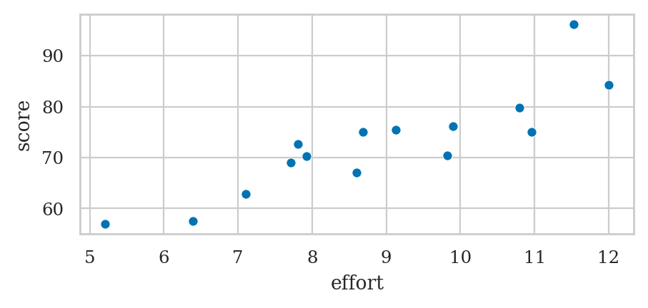
sns.scatterplot(data=students, x="effort", y="score");
Covariance and correlation#
students[["effort", "score"]].cov()
| effort | score | |
|---|---|---|
| effort | 3.8 | 17.10 |
| score | 17.1 | 99.59 |
students[["effort", "score"]].corr()
| effort | score | |
|---|---|---|
| effort | 1.00 | 0.88 |
| score | 0.88 | 1.00 |
students[["effort","score"]].corr().loc["score","effort"]
0.8794375135614694
Multiple numerical variables#
Extract data for the two groups:
dstudents = students[students["curriculum"]=="debate"]
dstudents
| student_ID | background | curriculum | effort | score | |
|---|---|---|---|---|---|
| 0 | 1 | arts | debate | 10.96 | 75.0 |
| 2 | 3 | arts | debate | 8.60 | 67.0 |
| 4 | 5 | science | debate | 9.90 | 76.1 |
| 5 | 6 | business | debate | 10.80 | 79.8 |
| 10 | 11 | business | debate | 9.82 | 70.4 |
| 11 | 12 | arts | debate | 11.53 | 96.2 |
| 12 | 13 | science | debate | 7.10 | 62.9 |
| 14 | 15 | arts | debate | 12.00 | 84.3 |
dstudents["score"].mean()
76.4625
lstudents = students[students["curriculum"]=="lecture"]
lstudents["score"].mean()
68.14285714285714
Strip plots#
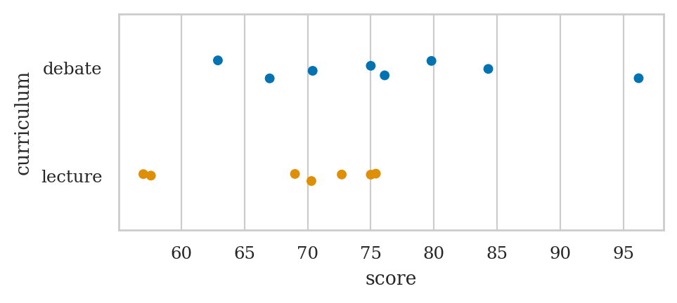
sns.stripplot(data=students, x="score", y="curriculum", hue="curriculum");
Histograms#
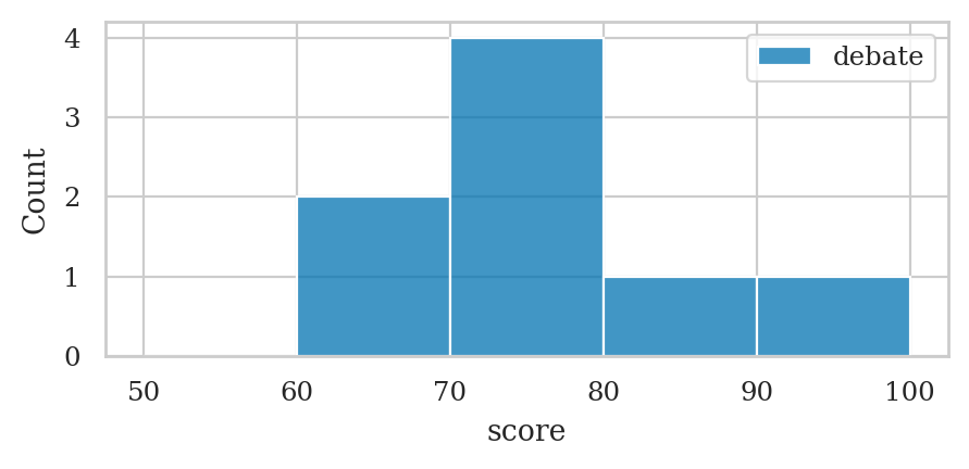
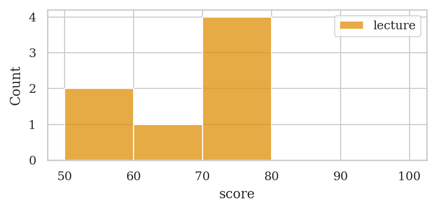
bins = [50, 60, 70, 80, 90, 100]
ax = sns.histplot(data=dstudents, x="score", bins=bins, color="C0")
ax.legend(labels=["debate"]);
ax = sns.histplot(data=lstudents, x="score", bins=bins, color="C1")
ax.legend(labels=["lecture"]);
Box plots#
sns.boxplot(data=students, x="score", y="curriculum", hue="curriculum");
Categorical data#
Definitions#
freq
relfreq
mode
(see text)
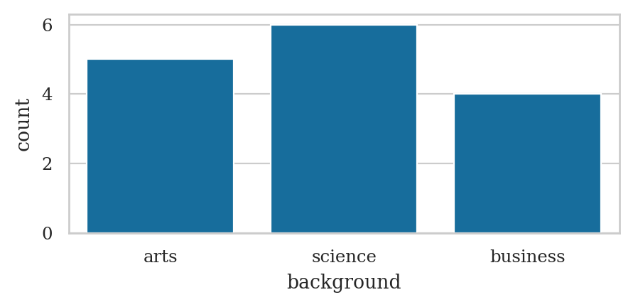
Analysis of the background variable#
backgrounds = students["background"]
The pandas methods .value_counts() can be used to compute the frequencies of any series or data frame.
backgrounds.value_counts()
background
science     6
arts        5
business    4
Name: count, dtype: int64
Use the option normalize=True for the methods .value_counts() to compute relative frequencies.
# relative frequencies
backgrounds.value_counts(normalize=True)
background
science     0.40
arts        0.33
business    0.27
Name: proportion, dtype: float64
The method .describe() shows some useful facts about the variable.
backgrounds.describe()
count          15
unique          3
top       science
freq            6
Name: background, dtype: object
# # ALT
# backgrounds.value_counts() / backgrounds.count()
# # ALT  combiend table with both frequency and relative frequency
# df2 = pd.DataFrame({
#     "frequency": backgrounds.value_counts(),
#     "relative frequency": backgrounds.value_counts(normalize=True)
# })
# df2
# bar chart of counts
sns.countplot(data=students, x="background");
# # ALT bar chart with relative frequencies
# df3 = (backgrounds
#  .value_counts(normalize=True)
#  .sort_index()
#  .rename("relative frequency")
#  .rename_axis("background")
#  .reset_index()
# )
# sns.barplot(data=df3, x="background", y="relative frequency")
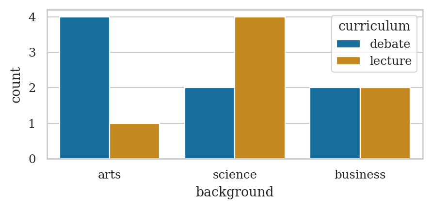
Comparing two categodescribeal variables#
students[ ["background","curriculum"] ]
| background | curriculum | |
|---|---|---|
| 0 | arts | debate |
| 1 | science | lecture |
| 2 | arts | debate |
| 3 | arts | lecture |
| 4 | science | debate |
| 5 | business | debate |
| 6 | science | lecture |
| 7 | business | lecture |
| 8 | business | lecture |
| 9 | science | lecture |
| 10 | business | debate |
| 11 | arts | debate |
| 12 | science | debate |
| 13 | science | lecture |
| 14 | arts | debate |
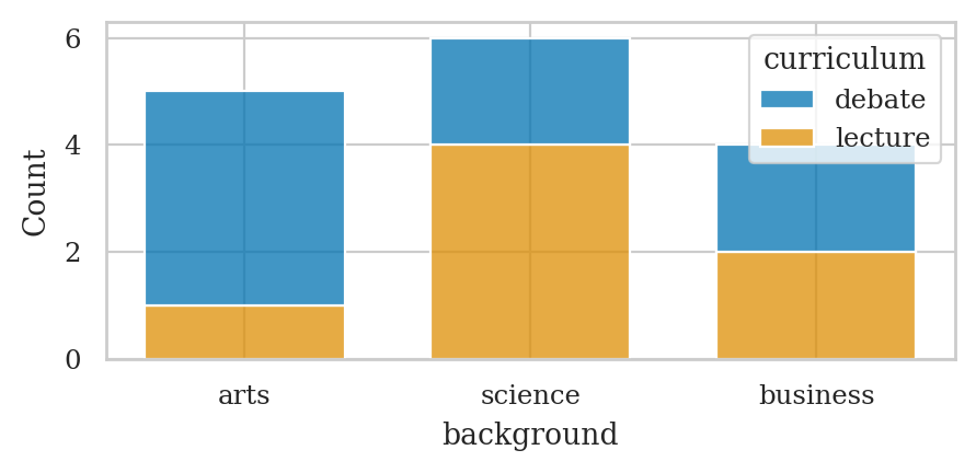
# joint frequencies
pd.crosstab(index=students["curriculum"],
            columns=students["background"],
            margins=True, margins_name="TOTAL")
| background | arts | business | science | TOTAL |
|---|---|---|---|---|
| curriculum | ||||
| debate | 4 | 2 | 2 | 8 |
| lecture | 1 | 2 | 4 | 7 |
| TOTAL | 5 | 4 | 6 | 15 |
# joint relative frequencies
pd.crosstab(index=students["curriculum"],
            columns=students["background"],
            margins=True, margins_name="TOTAL",
            normalize=True)
| background | arts | business | science | TOTAL |
|---|---|---|---|---|
| curriculum | ||||
| debate | 0.27 | 0.13 | 0.13 | 0.53 |
| lecture | 0.07 | 0.13 | 0.27 | 0.47 |
| TOTAL | 0.33 | 0.27 | 0.40 | 1.00 |
sns.countplot(data=students, x="background", hue="curriculum");
sns.histplot(data=students, x="background", shrink=.7,
             hue="curriculum", multiple="stack");
# # ALT  using displot
# sns.displot(data=students, x="background", hue="curriculum", multiple="stack", shrink=0.8)
# # ALT2  using pandas plot function for crosstab
# pd.crosstab(
#     index=students["curriculum"],
#     columns=students["background"],
# ).T.plot(kind="bar", stacked=True, rot=0)
# # stacked joint relative frequencies
# sns.histplot(data=students, x="background",
#              hue="curriculum", shrink=.7,
#              multiple="stack", stat="proportion")
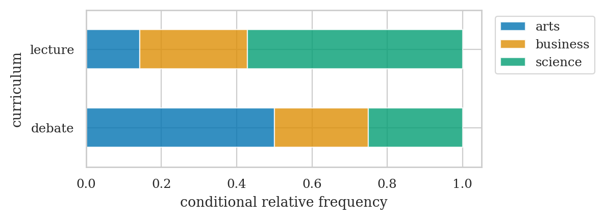
# curriculum relative frequencies conditional on background
pd.crosstab(index=students["curriculum"],
            columns=students["background"],
            margins=True, margins_name="TOTAL",
            normalize="columns")
| background | arts | business | science | TOTAL |
|---|---|---|---|---|
| curriculum | ||||
| debate | 0.8 | 0.5 | 0.33 | 0.53 |
| lecture | 0.2 | 0.5 | 0.67 | 0.47 |
ct1 = pd.crosstab(
    index=students["curriculum"],
    columns=students["background"],
    normalize="columns",
)
axct1 = ct1.T.plot(kind="bar", stacked=True, rot=0, alpha=0.8)
plt.legend(loc = "upper left", bbox_to_anchor=(1.02,1))
plt.ylabel("conditional relative frequency");
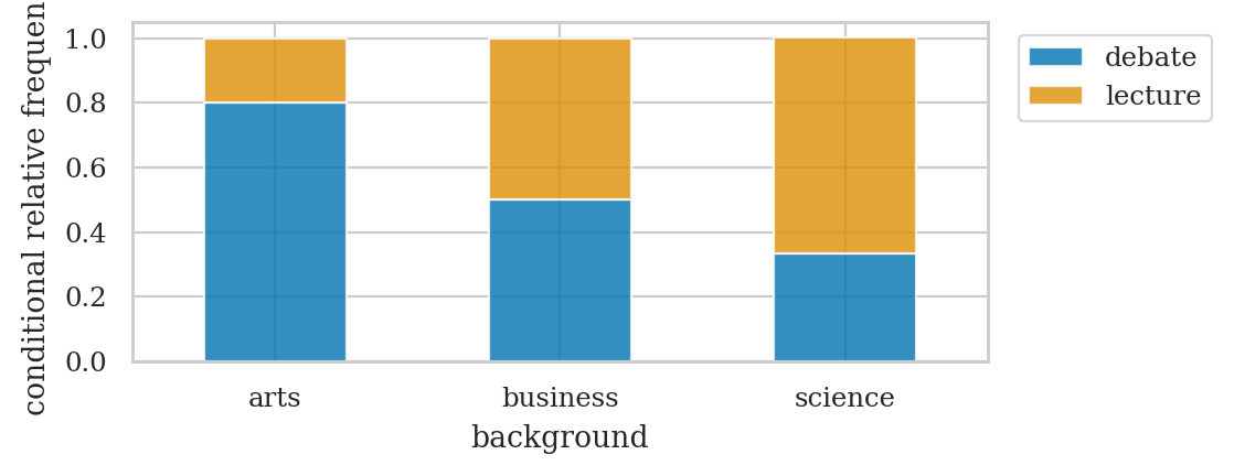
# background relative frequencies conditional on curriculum
pd.crosstab(index=students["curriculum"],
            columns=students["background"],
            margins=True, margins_name="TOTAL",
            normalize="index")
| background | arts | business | science |
|---|---|---|---|
| curriculum | |||
| debate | 0.50 | 0.25 | 0.25 |
| lecture | 0.14 | 0.29 | 0.57 |
| TOTAL | 0.33 | 0.27 | 0.40 |
ct2 = pd.crosstab(
    index=students["curriculum"],
    columns=students["background"],
    normalize="index",
)
axct2 = ct2.plot(kind="barh", stacked=True, rot=0, alpha=0.8, )
plt.legend(loc = "upper left", bbox_to_anchor=(1.02,1))
plt.xlabel("conditional relative frequency");
Explanations#
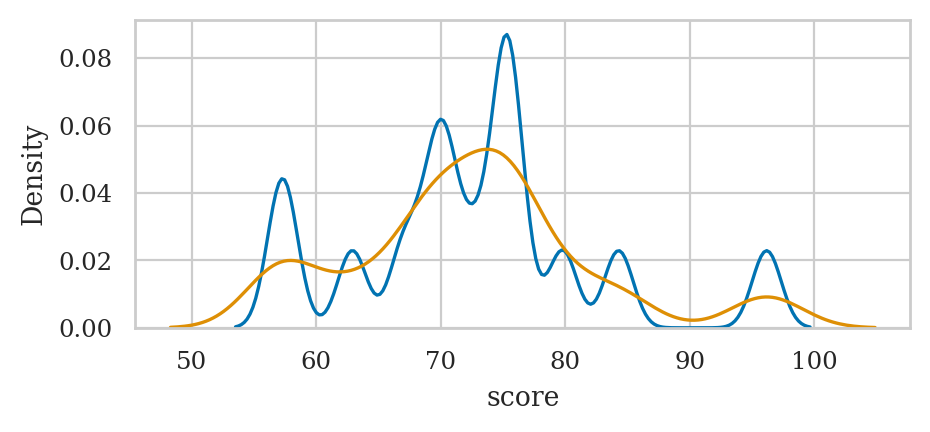
Kernel density plots#
sns.kdeplot(data=students, x="score", bw_adjust=0.2)
sns.kdeplot(data=students, x="score", bw_adjust=0.5);
Discussion#
Code implementations of median and quantile functions (bonus material)#
There are multiple methods for computing quantiles, which are well described in this Wikipedia article. https://wikipedia.org/wiki/Quantile#Estimating_quantiles_from_a_sample
Linear interpolation for the median#
When computing the median of a list of values, it’s not always possible to find a value from the list that satisfies the definition “splits the list into equal parts.” For example, if the list has an even number of elements, then there is no single “middle” number. The convention in this situation is to create a new number that consists of a 50-50 mix of the two middle numbers, a process known as linear interpolation.
The code below shows the procedure for calculating the median:
def median(values):
    n = len(values)
    svalues = sorted(values)
    if n % 2 == 1:            # Case A: n is odd
        mid = n // 2
        return svalues[mid]
    else:                     # Case B: n is even
        j = n // 2
        return 0.5*svalues[j-1] + 0.5*svalues[j]
The logic in the above function splits into two cases, depending on \(n\),
the length of the list of values. If \(n\) is odd, we return the middle
value from the list of sorted values svalues[mid]. If \(n\) is even, we
return a mixture of the two values straddling the midpoint.
It’s not important that you understand the details of the above code
snippet, since pandas will perform median calculations for you. I just
want you to be aware this interpolation is happening behind the scenes,
so you won’t be surprised if the \(\mathbf{Med}\) value you obtain is not one of
the observations in your dataset. For example, the median of a list of
integers is a decimal median([1,2]) = 1.5.
import numpy as np
assert median([1,300]) == np.median([1,300])
Linear interpolation for quantiles#
Linear interpolation is also used when computing quartiles, percentiles, and quantiles. In this section, we’ll explain the calculations and code for computing the \(q\)th quantile for the dataset for anyone interested in learning the technical details. Feel free to skip if you’re not passionate about code.
Suppose we want to compute the \(q\)th quantile for a list of \(n\) values \(\mathbf{x}=[x_0, x_1, x_2, \ldots, x_{n-1}]\). We’ll assume the values are already in sorted order. The \(q\)th quantile corresponds to the position \(p = q(n-1)\) within the list, where \(p\) is a decimal number between \(0\) (index of the first element) and \(n-1\) (index of the last element). We can split the position into an integer part \(i\) and a fractional part \(g\), where \(i = \lfloor p \rfloor\) is the greatest integer that’s less than or equal to \(p\), and \(g = p - \lfloor p \rfloor\) is what remains of \(p\) once we remove the integer part.
The \(q\)th quantile lies somewhere between the values \(x_i\) and \(x_{i+1}\) in the list. Specifically, the quantile computed by linear interpolation is a mixture with proportion \(g\) of \(x_{i+1}\) and \((1-g)\) of \(x_i\):
The code below shows the practical implementation of the math calculations described above.
def quantile(values, q):
    svalues = sorted(values)
    p = q * (len(values)-1)
    i = int(p)
    g = p - int(p)
    return (1-g)*svalues[i] + g*svalues[i+1]
The function we defined above is equivalent to the np.quantile(q) method
in pandas and NumPy, which uses the linear interpolation by default.
Note however, there are other valid interpolation methods for computing
quantiles that may be used in other statistics software, so don’t freak
out if you get different values when computing quantiles.
Everything we discussed about the quantile function also applies to
percentiles and quartiles. For example, the \(k\)^th^ quartile is given by
quantile(q=k/4), and the \(k\)^th^ percentile is quantile(q=k/100).
arr = [21, 22, 24, 24, 26, 97]
assert quantile(arr, 0.33) == np.quantile(arr, 0.33)
assert quantile(arr, 0.25) == np.quantile(arr, 0.25)
assert quantile(arr, 0.75) == np.quantile(arr, 0.75)
The function quantile we defined above:
Equivalent to
quantile(values, q, method="linear")innumpy.Equivalent to
quantile(values, q, type=7)in R.